My Role:
Art Director, Designer, UX/UI, Research
TRAIN IN MY SHOES
22Squared Intern Project
2021, the worst year in recent history for transgender especially transgender students who fall in love with sports, more than 69 sports bills ban them from participating in sports events consistent with their gender identity.
I worked on this campaign, aiming to raise awareness of the impacts of the anti-trans sports bills, and to encourage the public to discuss the issue in a more rational and well-informed manner.
The Experiential
Shoes Painting Challenge
We designed a sneaker painting challenge for all members and allies of the transgender community to join across social platforms.
And here are some some masterpieces we received.


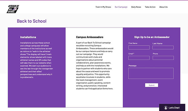
Back to School Installation


The Digital
Social Media
The primary social channel is instagram, one of the most popular platforms among Gen z. It is also a highly visual platform that fits very well with the campaign elements, such as the sneaker painting challenge.
There are different content categories for the posting schedule, including athlete stories, facts and news about the bills, campaign updates, and sneaker submissions. There are also polls and questions posted in stories to spark more discussions. And in the account bio, we put a Linktree that contains all the links to the website, petition, and other social media platforms.


Manifesto
The film will act as the emotional pull needed to attract an audience within and beyond our target. The goal of it is to highlight to the public how unfair these rules are from the perspective of a transgender athlete.
Campaign Visual Identity
Color Palette
The visual identity of the campaign is derived from the transgender flag.
The three colors on the flag are baby blue, representing boys, baby pink, representing girls, and white, representing people who are transitioning or have unidentified gender.
After thinking about the different gender indications of the flag colors, I decided to add a PURPLE shade to the campaign because purple is the mix of blue and red. Conceptually, it represents the "whole", which encompasses all the gender preferences.
And that’s why there are 3 color families in the color palette: the pink-to-red shade, the blue shade, and the purple shade. All these colors are vibrant, bright, and have a high saturation. Visually, they convey a feeling of energy and work well with the sports theme.
I also decided to link all the colors by using gradient, because these colors are so different that it could cause visual disconnection when use them separately. The use of gradients will allow us to utilize all the colors in various ways, while still keeping a unified visual identity.
Meanwhile, because of the high saturation and how all these colors are competing with each other, instead of using them in a large scale in the design, I only used them as the accent color on a black or white background to emphasize the campaign message.


Typography
Davis Sans and Rockets Battle Demo.
Because our campaign is educational and informational, I decided to go with Davis Sans, a sans serif that is clean, easy to read, and comes with various weights and font styles. This typeface is mainly used for designs that are information heavy, such as social media posts that contain lots of content.
On the other hand, Rockets Battle Demo is a typeface that simulates brush strokes. In the design, it serves as a highlight for our key messages, where people can easily recognize the font. I want to go with the feeling of brush strokes because, first, it humanizes our message, and second, the power and strength that the strokes show fit very well with the sport context.


Logo & Wordmark


Based on the creative idea “train in my shoes”, I first came up with a sneaker icon, and then I colored it with the gradient. Finally, I wrapped the sneaker with the tagline using the Davis Sans typeface. The logo lives on our executions and on social media as our profile picture.
In addition to the logo, I also created a wordmark of the tagline using the Rocket Battle Demo typeface. This is mainly used for banner designs or digital designs where we need to display the key message of the campaign.